
To master pattern drenching, start by choosing a cohesive color palette that connects all prints and décor. Mix large, bold patterns with smaller, intricate ones to create visual balance and rhythm. Repeat patterns across walls and accessories to guide the eye smoothly through the space. Focus on matching hues and styles, ensuring prints complement rather than clash. Paying attention to scale and placement will help you achieve a harmonious, stylish room—continue exploring these tips for even more inspiring ideas.
Key Takeaways
- Use a cohesive color palette to unify prints across walls and décor, creating visual harmony.
- Vary pattern scales, combining large bold prints with smaller intricate ones for balance.
- Repeat similar patterns or motifs in different décor elements to establish rhythm.
- Incorporate matching or complementary colors to guide the eye and enhance cohesion.
- Balance patterned and solid elements to prevent overwhelm and maintain an inviting atmosphere.

Have you ever wondered how to create a cohesive and stylish space using matching prints in your walls and décor? It’s a clever way to bring your room together seamlessly, making it feel intentional and polished. The key lies in understanding how to use color coordination and achieve visual harmony. When you select prints that complement each other, whether on your walls or in your accessories, you establish a sense of unity that draws the eye effortlessly across the space.
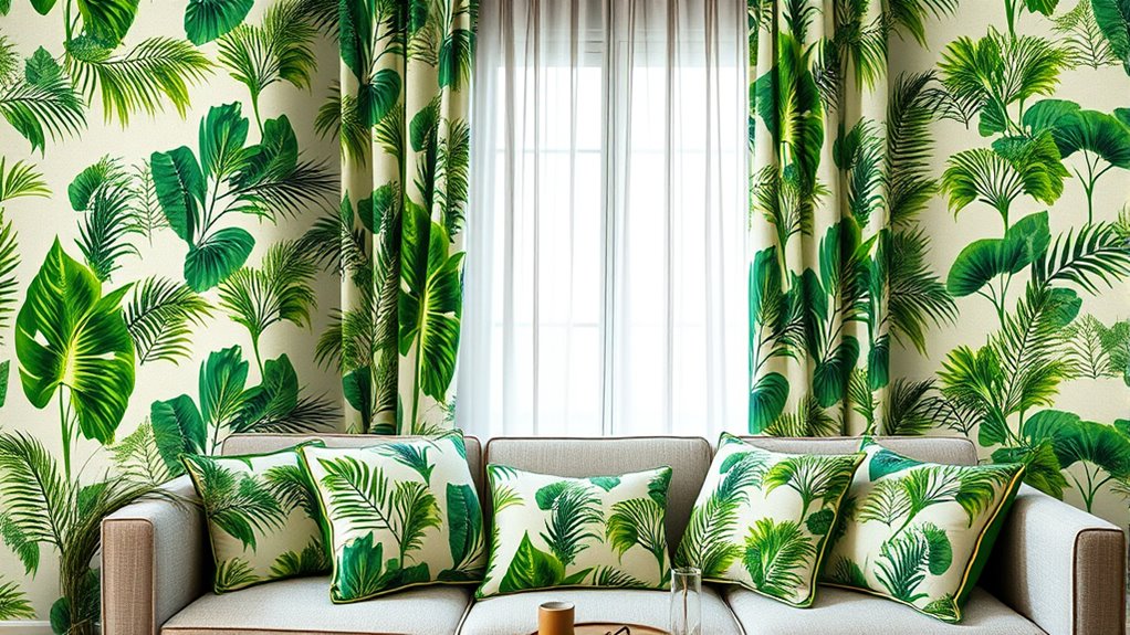
Start by choosing a dominant color palette. This doesn’t mean everything has to be the exact same shade, but rather that your prints share a common hue or tone. For example, if you love soft blues and warm neutrals, opt for prints that incorporate these shades. This consistency allows you to mix and match different patterns without overwhelming the senses. Think of it as creating a visual thread that runs through the entire room, tying all elements together with subtlety and sophistication.
Choose a unifying color palette to seamlessly blend patterns and décor for a sophisticated, cohesive look.
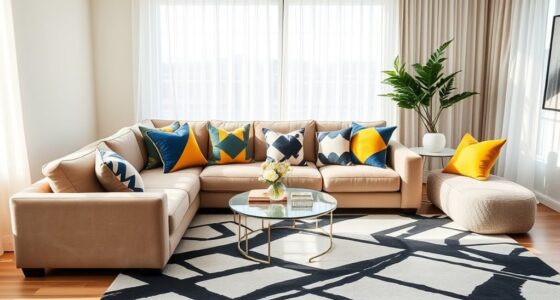
Next, pay attention to how the prints interact in terms of scale and style. Combining large, bold patterns with smaller, more intricate ones can add depth without disrupting the overall harmony. If your wall has a prominent floral wallpaper, choose décor items with smaller, more understated prints that echo the same style or color theme. This balance prevents the room from feeling chaotic and maintains a visual flow. When prints complement each other in scale and style, your décor becomes a cohesive narrative rather than a collection of unrelated pieces.
In terms of placement, think about how the prints guide the eye. Matching prints across walls and décor create a rhythm that leads viewers from one focal point to another. For example, if your wall art features geometric patterns, incorporate smaller geometric accents on throw pillows or rugs. This repetition reinforces the pattern and enhances the overall visual harmony. It’s not about perfect matching but rather about creating a deliberate relationship between different patterns and textures.
Finally, don’t forget to consider the mood you want to evoke. Light, airy prints can make a space feel fresh and open, while darker, richer patterns add a cozy or dramatic touch. When your prints work together through thoughtful color coordination, your space feels balanced and inviting. Achieving this level of cohesion might take some experimentation, but once you find the right combination, your room will radiate a sense of style and harmony that’s both intentional and inspiring.
Additionally, understanding the principles of visual harmony can greatly improve your ability to combine different prints successfully, making your interior design feel more cohesive and refined.
Frequently Asked Questions
How Do I Choose the Right Pattern Scale for My Space?
To choose the right pattern scale for your space, focus on maintaining scale balance and pattern proportion. If your room is small, opt for smaller prints that won’t overwhelm the area. For larger spaces, bigger patterns create visual interest without feeling overpowering. Measure your walls and décor, then select prints that complement these sizes, ensuring the scale feels harmonious and balanced throughout your space.
Can Pattern Drenching Work in Small or Crowded Rooms?
Pattern drenching can work in small or crowded rooms if you consider scale considerations carefully. Think of it like a busy city street; if everything’s scaled down, it feels lively but not overwhelming. You want to avoid visual clutter, so choose prints that are proportionate to your space. Use smaller patterns or keep the drenching subtle to create a cohesive look without making the room feel cramped.
What Are Common Mistakes to Avoid When Matching Prints?
When matching prints, avoid common mistakes like overusing pattern repetition, which can overwhelm your space and disrupt visual balance. Be careful not to mismatch prints that clash or compete for attention; instead, choose complementary patterns that create harmony. Confirm the scale of your patterns works well with the room size. Keeping these tips in mind helps you achieve a cohesive look without clutter, making your room feel thoughtfully designed.
How Do Lighting Conditions Affect Pattern Matching Decisions?
Lighting impact plays a vital role in your pattern matching decisions. Natural light reveals true colors and details, helping you see how prints will look throughout the day. Artificial lighting can distort hues, making it harder to match patterns seamlessly. You should check your décor under different lighting conditions to guarantee consistency. This way, you can make confident choices that look great whether during daytime or evening.
Are There Specific Color Combinations That Work Best Together?
Think of color combinations as a dance, where harmony and contrast balance keep everyone in step. You’ll find that complementary colors, like blue and orange, create vibrant contrast, while analogous hues, like green and teal, foster soothing harmony. Stick to a color palette that emphasizes this balance, and your pattern matching will feel cohesive and lively. Trust your eye, and don’t be afraid to experiment with bold contrasts or subtle blends.
Conclusion
By matching prints across your walls and décor, you create a cohesive and stylish space that truly reflects your personality. Don’t be afraid to take the plunge and experiment—sometimes, a bold move pays off. When you coordinate patterns thoughtfully, it’s like tying a bow on a present, making your home feel polished and inviting. So go ahead, embrace the trend, and watch your space come alive with personality and charm.