
When your wall art looks right, it’s because you’ve thoughtfully coordinated colors, frames, and layout to create harmony and balance. You avoid randomness by balancing bold and subdued hues, using similar or intentionally contrasting frame styles, and arranging pieces in a way that directs the eye smoothly across the display. If you pay attention to these principles, your wall art will feel curated and cohesive. Keep exploring, and you’ll discover even more ways to perfect your display.
Key Takeaways
- Consistent color coordination and complementary palettes create visual harmony, making art feel intentional.
- Thoughtful arrangement, balancing large and small pieces, prevents a chaotic or random appearance.
- Similar or purposefully mixed frame styles, with deliberate spacing, unify the display.
- Distributing bold and subdued hues evenly maintains a balanced, cohesive look.
- Overall coherence in style, spacing, and layout helps the wall art feel curated rather than random.
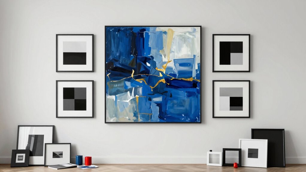
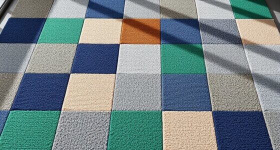
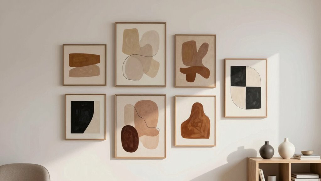
When it comes to decorating your walls, understanding why some arrangements look perfectly balanced while others seem random can make all the difference. The key often lies in how you approach color coordination and frame styles. If you want your wall art to feel cohesive and intentional, paying attention to these details is essential. First, think about color. When you select artwork or photos, consider a color palette that complements your room’s overall scheme. Sticking to a few dominant colors creates harmony, making the display feel unified rather than chaotic. For example, if your room features cool tones like blues and grays, choosing wall art that echoes these colors helps everything blend seamlessly. Conversely, if you prefer a more eclectic look, contrasting colors can add vibrancy, but even then, balance is critical. For instance, distributing bold and subdued hues evenly across your arrangement prevents it from looking haphazard.
Coordinate colors and frame styles thoughtfully for a cohesive, balanced wall display.
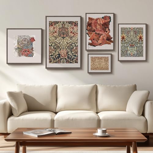
Frame styles also play a crucial role in achieving visual harmony. Different frame types can either unify the collection or create a fragmented, disjointed appearance. Using similar frame styles—such as sleek black frames or ornate gold ones—connects the individual pieces, making the entire arrangement feel intentional. Mixing various styles can work too, but only if done thoughtfully. For example, combining modern, minimalist frames with vintage, decorative ones can add interest, provided you balance their placement carefully. Think about spacing as well; consistent gaps between frames contribute to a tidy look, while irregular spacing might evoke a more casual, spontaneous vibe.
When arranging your wall art, keep in mind that visual weight matters. Larger pieces tend to draw attention, so balance them with smaller works to avoid a lopsided appearance. Grouping similar items together, either in a grid or a salon-style layout, helps create rhythm and flow. Remember, symmetry isn’t always necessary—sometimes asymmetry adds personality—but it should still feel deliberate rather than chaotic. Pay attention to the overall composition, ensuring that your color choices and frame styles support one another. If you mix different frame styles, try to connect them through a common color or motif to tie everything together. Recognizing visual harmony principles can help you craft a more cohesive and appealing display. Additionally, understanding color theory can provide deeper insight into creating visually pleasing arrangements.
In the end, creating a balanced look hinges on your understanding of these elements. When you coordinate colors thoughtfully and select frame styles that complement your theme, your wall art will look right—appealing and harmonious—rather than random and cluttered. Your space becomes a curated reflection of your style, inviting admiration from anyone who steps inside.

ArtbyHannah Gallery Wall Frame Set, 8 Pack Picture Frames Collage Wall Decor with Neutral Pampas Grass Art for Living Room, Assorted Size Including 11"x14", 8"x10", 5"x7"(Beige Frame)
【Neutral Gallery Wall Art】This neutral landscape artwork featuring pampas grass and desert scenery combines soothing earth tones and…
As an affiliate, we earn on qualifying purchases.
As an affiliate, we earn on qualifying purchases.
Frequently Asked Questions
How Does Wall Art Influence Room Ambiance?
Wall art influences your room’s ambiance by shaping the mood and creating a sense of harmony. When you choose pieces with color harmony, they blend seamlessly with your decor, making the space feel balanced and inviting. The right art can set a calming or energizing mood, depending on your choice. It’s a powerful way to express your personality and make your room truly feel like home.
What Are Common Mistakes in Hanging Wall Art?
Poor planning, placement, and proportion often cause wall art to feel misplaced. You might choose a frame that clashes with your décor or neglect to take into account color coordination, making pieces look out of sync. Avoid common mistakes like hanging art too high or low and ignoring eye level. Use balanced spacing, select frames that complement your space, and guarantee your art resonates with your room’s style for a harmonious, inviting atmosphere.
How Do Scale and Proportion Affect Wall Art Placement?
Scale and proportion are key to achieving harmony in wall art placement. When your artwork’s size complements the space, it creates a balanced look that feels natural. Larger pieces should be proportionate to the wall, while smaller ones can be grouped for balance. By considering scale harmony and proportion balance, you guarantee your art enhances the room without overwhelming or seeming out of place, making the overall design feel cohesive.
Can Wall Art Hide Flaws or Imperfections?
You can definitely hide flaws or imperfections with wall art if you play your cards right. Choose pieces that complement your room’s color coordination and add texture contrast to draw attention away from any trouble spots. A well-placed artwork can be a distraction, turning the focus to something beautiful instead of flaws. Just remember, it’s about creating harmony—sometimes what seems like a cover-up actually enhances your space’s overall charm.
What Are Tips for Creating a Balanced Gallery Wall?
To create a balanced gallery wall, start with color coordination by choosing artwork that complements your room’s palette. Mix frame styles for visual interest but keep some consistency to avoid chaos. Arrange pieces in a way that balances sizes and shapes, leaving enough space between them. Use a template or lay out your art on the floor first, ensuring your gallery looks cohesive and feels intentional rather than random.

Madison Park Laurel Wall Art – Laser Cut Carved Botanical Tree Branches, Genuine Fir Wooden Framed, Rustic Finish – Modern Farmhouse Décor for Living Room, Ready to Hang Panel, 12 x 36, Natural Grey
DESIGN – Laurel branches carved wood wall art designed by Emily Warme, laser cut pattern in Antique Grey…
As an affiliate, we earn on qualifying purchases.
As an affiliate, we earn on qualifying purchases.
Conclusion
So, next time you hang art, remember—it’s not just about tossing pictures on the wall and hoping for the best. If you want that gallery-worthy vibe, think about balance, spacing, and maybe even a little chaos that’s actually intentional. Because, really, if everything looks perfect, it’s probably boring. Embrace the quirks, trust your gut, and turn your walls into a masterpiece that feels just right—without the random, of course.
Framed William Morris Gallery Wall Art Set of 5, Vintage Colorful Botanical Floral Prints, Retro Boho Artwork for Living Room, Bedroom, Home Office, Hallway Decor
[Framed William Morris Wall Art]: Our framed vintage William Morris wall art set includes 5 pieces: 1 piece…
As an affiliate, we earn on qualifying purchases.
As an affiliate, we earn on qualifying purchases.

Colorful Inspirational Quote Wall Decals Motivational Phrase Wall Decor Sticker Watercolor Paint Splatter Wall Decals Handprint Positive Saying Wall Stickers for Kids Room Decor Playroom School
wall decor
As an affiliate, we earn on qualifying purchases.
As an affiliate, we earn on qualifying purchases.