Exploring moody hues like rich greens, deep blues, and earthy browns lets you create spaces filled with emotion, elegance, and history. These colors evoke calm, stability, and mystery, helping you craft designs that feel timeless and soulful. Rich greens symbolize growth, blues suggest trust and serenity, while browns ground your space with warmth. If you continue, you’ll uncover how these hues can transform your interior, artwork, or style with emotional depth and cultural richness.
Key Takeaways
- Moody hues like deep greens, blues, and browns evoke emotions such as calm, stability, and mystery, enhancing atmosphere and mood.
- Rich greens symbolize growth and renewal, making them ideal for tranquil, nature-inspired spaces.
- Dark blues like navy and midnight suggest trust, serenity, and introspection, suitable for quiet or sophisticated environments.
- Browns ground designs with warmth and earthiness, connecting to tradition and natural elements.
- These colors have historical and cultural significance, used across art, fashion, and interior design to convey depth and storytelling.

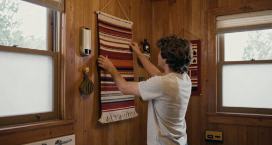
Have you ever noticed how moody hues can transform a simple scene into something evocative and intense? These deep, rich colors evoke emotion and depth, elevating your space or artwork from ordinary to extraordinary. When you explore the world of moody hues like rich greens, blues, and browns, you’re tapping into a powerful domain of color psychology. These shades can evoke feelings of calm, introspection, and sophistication. They’re not just random choices; they’re rooted in centuries of design and cultural significance, reflected in historical color palettes that have stood the test of time. For example, deep forest greens have long symbolized stability and growth, while navy and midnight blues suggest trust and mystery. Browns, from warm chocolate to cool taupe, ground your design with warmth and earthiness, connecting you to nature and tradition. Incorporating rustic decor elements can further enhance the cozy, timeless appeal of these hues. Understanding the influence of color psychology helps you harness these hues effectively. Moody greens, for instance, can invoke a sense of renewal and balance, perfect for creating a tranquil retreat or a workspace that fosters focus. Blues, especially darker shades, foster serenity and introspection—ideal for bedrooms or quiet corners where you want to encourage thoughtfulness. Browns add a sense of solidity and comfort, making them perfect for cozy living rooms or rustic settings. These colors aren’t just aesthetic choices; they influence mood and behavior, meaning you can craft environments that promote relaxation, concentration, or even a touch of mystery. Looking back at historical palettes, you’ll notice how these hues have been favored by artists and designers across centuries. From the lush greens in medieval tapestries to the deep blues of Renaissance paintings, these colors have long been associated with richness and depth. Artists used moody hues to convey emotion, mood, and atmosphere, a tradition you can now incorporate into your own projects. Whether you’re designing a room, choosing artwork, or selecting fashion, understanding the roots of these colors helps you create a cohesive, meaningful aesthetic. In addition, selecting vintage-inspired accessories can help tie the palette together seamlessly. Incorporating moody hues into your environment isn’t just about color; it’s about creating a mood and telling a story. By understanding the impact of color psychology and drawing inspiration from historical palettes, you can craft spaces and visuals that resonate deeply. These shades aren’t merely trendy—they’re timeless, capable of transforming the simplest scene into something emotionally charged and visually compelling. So, embrace these rich greens, blues, and browns, and let their history and psychology guide your creative journey.

ALL-IN-ONE Paint by Heirloom Traditions, Crete (Olive Green), Quart – Durable cabinet and furniture paint. Built in primer and top coat, no sanding needed. Includes our 30 featured color card.
- Color Card Included: 30 featured and new colors sample card
- All-In-One Paint: No sanding, priming, or top coat needed
- Versatile Use: Suitable for interior and exterior surfaces
As an affiliate, we earn on qualifying purchases.
As an affiliate, we earn on qualifying purchases.
Frequently Asked Questions
How Can I Incorporate Moody Hues Into Small Spaces Effectively?
To incorporate moody hues into small spaces effectively, start with strategic furniture placement to avoid clutter and maximize light. Use rich greens, blues, and browns on accent walls or in textiles like cushions and curtains. Incorporate wall textures such as matte or velvet finishes to deepen the moody effect. Keep the space balanced with lighter elements to prevent it from feeling cramped, creating a cozy yet sophisticated atmosphere.
Which Moods or Emotions Do Rich Greens, Blues, and Browns Evoke?
Oh, the irony is that these moody hues actually evoke calm, stability, and introspection despite their intense appearances. Rich greens bring harmony and growth, blues foster tranquility and trust, while browns evoke warmth and security. In color psychology, these shades trigger emotional responses that make you feel grounded, serene, and contemplative. So, embracing these hues can transform your space into a peaceful retreat that subtly influences your mood.
Are There Specific Lighting Conditions That Enhance These Moody Colors?
Yes, you can enhance moody colors with specific lighting. Natural light during the golden hour brings out deep greens, blues, and browns, creating a warm, inviting atmosphere. Artificial lighting, like dim, warm LEDs or soft tungsten bulbs, emphasizes the richness of these hues while maintaining their moody feel. Experimenting with light direction and intensity helps you highlight the textures and depth of these colors, making your space or artwork more compelling.
What Complementary Colors Work Well With Deep Greens, Blues, and Browns?
Imagine a lush forest scene—your colors come alive with perfect contrasts. Deep greens, blues, and browns pair beautifully with warm terracotta, soft creams, or muted oranges. These color pairings create stunning design contrasts that highlight the moody hues. To enhance their richness, choose complementary colors that provide balance and depth, making your space feel inviting yet sophisticated. Play with these contrasts to evoke emotion and harmony effortlessly.
How Do Different Materials Influence the Appearance of Moody Hues?
Different materials influence moody hues through texture effects and surface finishes. For instance, matte finishes soften deep greens and blues, creating a subtle, understated mood, while glossy surfaces make these hues more vibrant and dramatic. Textured materials like rough wood or stone add depth and complexity, enhancing the richness of browns and blues. Your choice of surface finish and texture effects can dramatically alter the emotional impact of moody hues in any space.

MIULEE Velvet Throw Pillow Covers 18×18 Inch, Pack of 2 – Dark Blue, Super Soft Decorative Square Cushion Cases Modern Luxury Home Decor for Sofa, Couch, Bed, Chair
- Luxurious Velvet Fabric: Soft plush texture on both sides
- Versatile Home Decor: Suitable for various rooms and occasions
- Invisible Zipper Design: Sleek, hidden zipper for easy use
As an affiliate, we earn on qualifying purchases.
As an affiliate, we earn on qualifying purchases.
Conclusion
As you embrace these moody hues, think of them as a stormy sky after a long day—powerful yet calming. Just like how a deep blue can evoke serenity, a rich brown grounds your space, creating a cozy refuge. Remember, color is your storytelling tool; it’s like painting your own emotional landscape. So, don’t shy away from exploring these bold shades—they’ll help you craft a space that’s as dynamic and inviting as a sunset after rain.

Dawhud Direct Decorative Votive Candle Holders, Vintage Decor Flameless Candlescape Set, 3 LED Tea Light Candles, Rocks and Tray – Fall Table Decor (Earth Tones)
- Warm Seasonal Centerpiece: Creates cozy fall gatherings and decor
- Versatile Candle Display: Includes 3 flameless LED tea lights with batteries
- Homey Natural Decor: Features natural tones, glass holders, and pebbles
As an affiliate, we earn on qualifying purchases.
As an affiliate, we earn on qualifying purchases.

Trade Secret Scratch Concealer for Dark Wood Furniture & Floors – Dark Brown Shade Stain Covers Nicks, Scuffs, Dog & Cat Scratches, Minor Defects – Real Wood Only
- Suitable for Dark Hardwood & Veneers: Covers scratches on dark wood surfaces
- Camouflages Discoloration: Conceals scratches and minor defects
- Wax-Free, Streak-Free Formula: No sticky residue or wax buildup
As an affiliate, we earn on qualifying purchases.
As an affiliate, we earn on qualifying purchases.