Room colors profoundly influence your mood and behavior through their emotional impacts. Warm tones like red and yellow boost energy and foster social connection, while cool hues such as blue and green promote calmness and relaxation. Neutral shades provide balance and stability, helping you feel more at ease. Bright colors energize you, pastel shades offer tranquility, and cultural meanings can shape your perception. Exploring these color effects further can help you create spaces that support your well-being.
Key Takeaways
- Bright colors like red and yellow can boost energy and create feelings of excitement or urgency in a space.
- Soft hues such as blue and green promote calmness, relaxation, and mental well-being.
- Neutral tones like beige, gray, and taupe help establish harmony and reduce overstimulation.
- Warm colors foster intimacy and social connection, while cool colors enhance tranquility and stress reduction.
- Cultural perceptions of colors influence emotional responses, emphasizing the importance of mindful color choices in room design.
The Science Behind Color Perception and Emotions
Color perception is a complex process that directly influences our emotions and behaviors. When you see different colors, your brain interprets these signals, triggering specific emotional responses. For example, bright colors like yellow or red often evoke feelings of excitement or urgency, while softer hues like blue or green promote calmness and relaxation. This connection between color perception and emotional responses stems from both biological factors and personal experiences. Your eyes detect wavelengths of light, which your brain processes to create meaningful impressions. These impressions can influence your mood, decision-making, and even your physiological reactions. Understanding this science helps explain why certain colors can boost your mood or make you feel more alert. Additionally, bias in AI outputs can subtly influence visual design choices and perceptions, highlighting the importance of mindful color selection. It’s a powerful reminder of how deeply visual cues shape your emotional landscape.
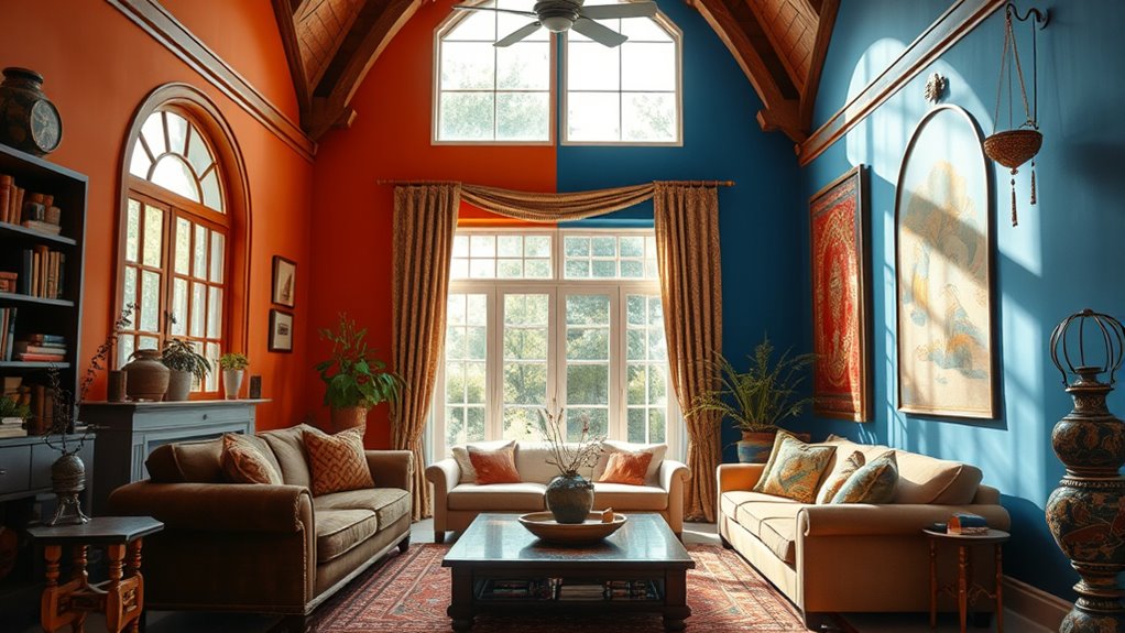
Warm Colors and Their Impact on Mood
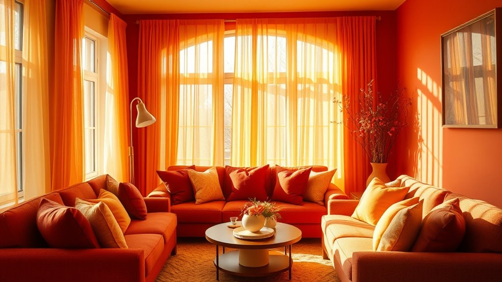
Warm colors like red can boost your energy and grab your attention instantly. They create a sense of comfort and warmth that makes spaces feel inviting. Understanding their impact helps you choose colors that influence your mood effectively. Incorporating mindfulness practices in your environment can further enhance the positive effects of warm colors.
Energizing Effects of Red
Red’s vibrant hue can instantly boost your energy and alertness, making it a powerful tool for enhancing mood. Incorporating red decor into your space can create energetic interiors that stimulate activity and focus. This color is known for increasing heart rate and adrenaline, helping you feel more motivated and lively. Whether you choose bold red walls or accents like cushions and art, you’ll find it energizes your environment. Red’s stimulating qualities make it ideal for areas where you want to stay active or alert, such as kitchens, gyms, or workspaces. Just remember, too much red can feel overwhelming, so balance it with neutral tones to maintain a lively yet comfortable atmosphere. Embracing color psychology can help you select the best hues to influence your mood positively.
Comfort and Warmth
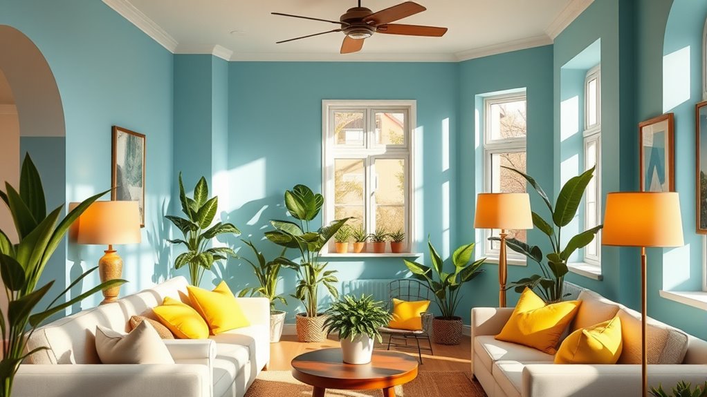
When you surround yourself with warm hues, you can instantly create a cozy and inviting atmosphere that soothes your mind and lifts your spirits. Warm colors like reds, oranges, and yellows carry strong color symbolism related to comfort, energy, and positivity. They influence your perception of temperature, making a space feel warmer even if the thermostat stays the same. These hues evoke feelings of safety and intimacy, helping you relax and feel more at ease. The psychological impact of warm colors taps into our innate associations with sunlight and warmth, fostering a sense of comfort. Additionally, incorporating these tones into your decor can enhance the overall interior ambiance, making your space feel more welcoming and lively. By choosing the right warm tones, you craft an environment that encourages relaxation, social connection, and emotional well-being.
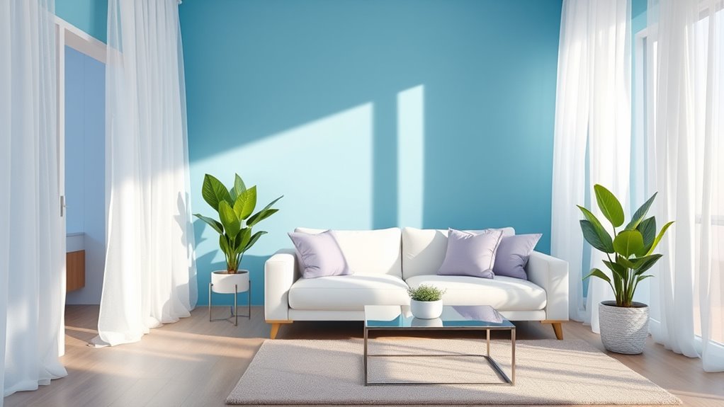
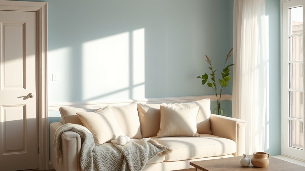
Cool Colors and Their Calming Effects

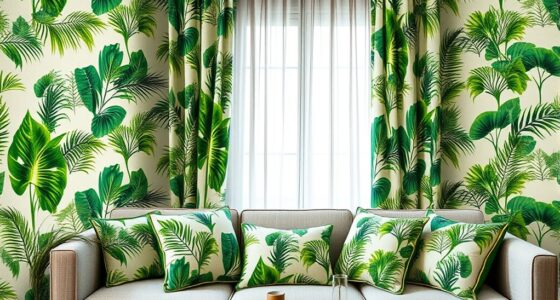
Cool colors like blue and green can create a sense of tranquility and help you relax. They also boost your focus and clarity, making it easier to concentrate on tasks. Plus, these hues can lower your stress levels, promoting overall calmness. Incorporating unique and wicked planters in your space with cool tones can further enhance this peaceful environment.
Tranquility and Relaxation
Have you ever noticed how a peaceful blue sky or a calm lake can instantly soothe your mind? That’s the power of cool colors in action. These shades, like soft blues and gentle greens, are often used in color therapy to promote tranquility and relaxation. They help slow your breathing, lower your heart rate, and create a sense of calm that encourages mood regulation. When you surround yourself with these hues, you invite serenity into your space, making it easier to unwind after a stressful day. Cool colors don’t just look peaceful—they actively influence your emotional state. By incorporating them into your environment, you can foster a soothing atmosphere that supports relaxation and mental clarity.
Enhancing Focus and Clarity
Ever wonder how certain colors can sharpen your focus? Cool colors like blue and green are key in enhancing clarity through color therapy. They promote calmness, which boosts your visual perception and reduces distractions. These hues help clear mental clutter, making it easier to concentrate on tasks. Understanding their effects can improve your workspace environment, fostering productivity. Here’s a quick look at how cool colors influence focus:
| Color | Effect on Focus |
|---|---|
| Blue | Increases alertness, sharpens concentration |
| Green | Reduces eye strain, promotes balance |
| Teal | Combines calming and focusing qualities |
| Cyan | Refreshes mind, enhances clarity |
Using cool colors strategically supports mental clarity and heightens focus, creating an ideal environment for productivity.
Reducing Stress Levels
Since stress can quickly overwhelm your mind, incorporating calming colors like blue and green into your environment can make a significant difference. These cool colors are often used in color therapy to promote relaxation and reduce anxiety. By choosing shades of blue or green for your walls or decor, you create a soothing atmosphere that encourages stress reduction. Cool colors help slow your heart rate and lower blood pressure, making it easier to unwind after a hectic day. Using these colors intentionally can enhance your mental clarity and emotional stability. When you surround yourself with calming hues, you activate your body’s natural relaxation response, helping you feel more centered and less overwhelmed. Incorporating blue and green into your space can be a simple yet effective way to manage stress levels naturally.
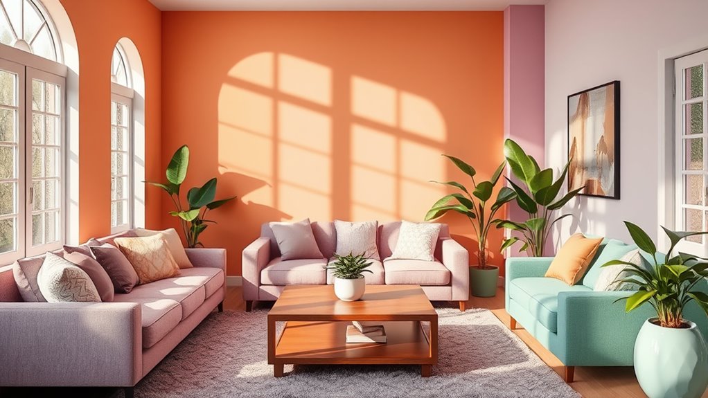
Bright and Bold Colors to Boost Energy
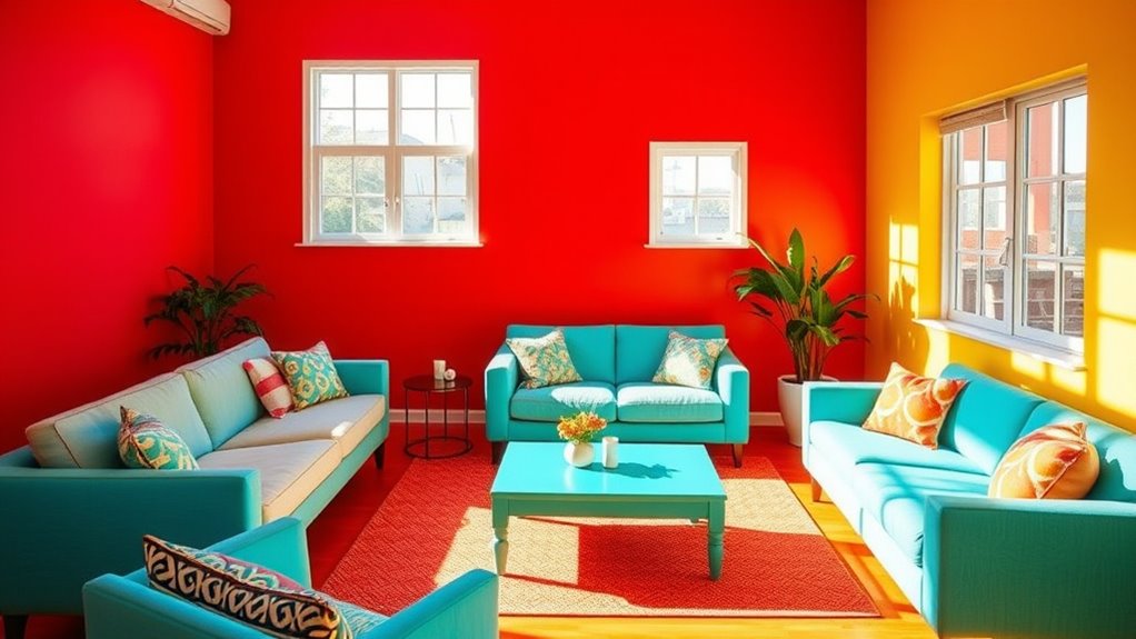
Bright and bold colors can considerably enhance your energy levels by stimulating your senses and lifting your mood. In color therapy, vibrant hues like reds, oranges, and yellows are used to promote alertness and enthusiasm. These colors create strong visual stimulation that energizes your space and your mind. When you incorporate bright reds or lively oranges into your room, you encourage activity and motivation, making them ideal for workspaces or areas where you want to stay alert. The key is to choose colors that invigorate you without overwhelming your senses. By strategically using bold colors, you can boost your exuberance and maintain a lively atmosphere that keeps you motivated throughout the day. Incorporating color psychology principles can help you select the most effective hues to influence your mood positively.
Neutral Tones and Their Role in Creating Balance
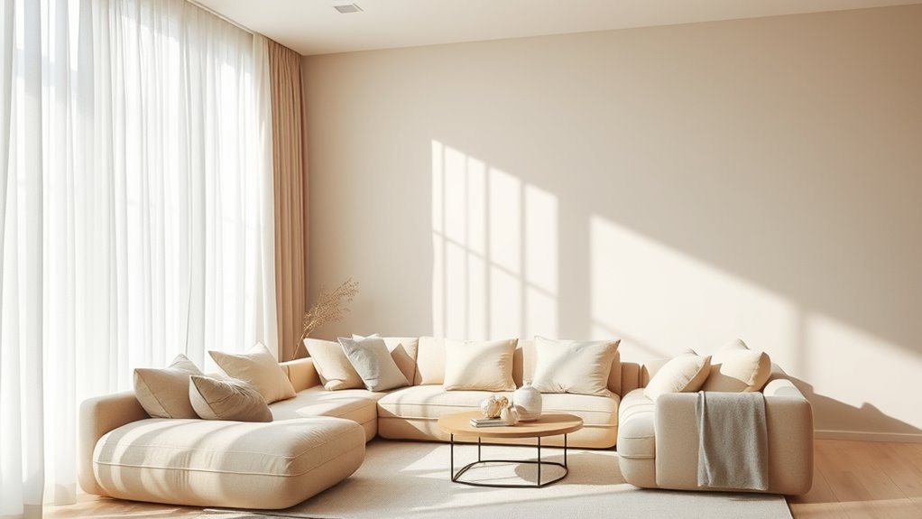
Neutral tones like beige, gray, and taupe play an essential role in creating a balanced and calming environment. They serve as a foundation that promotes visual balance, making your space feel harmonious and serene. These colors prevent overstimulation and help other vibrant accents stand out without overwhelming the senses. Incorporating neutral tones allows you to craft a versatile and timeless look that adapts to changing moods or styles. Use the table below to understand how different neutral shades influence your space:
| Neutral Tone | Effect on Mood | Best Use |
|---|---|---|
| Beige | Warmth, comfort | Living rooms, bedrooms |
| Gray | Calm, sophistication | Offices, lounges |
| Taupe | Balance, stability | Dining areas, entryways |
| Ivory | Cleanliness, clarity | Kitchens, bathrooms |
| Charcoal | Depth, focus | Accent walls, study areas |
Additionally, neutral tones can enhance interior versatility by providing a flexible backdrop that complements various color schemes and decor styles.
How Color Choices Influence Productivity and Focus

Bright colors can energize your workspace and keep you alert, making it easier to stay productive. Calm hues, like blues and greens, help you focus by reducing stress and minimizing distractions. Choosing the right color for your environment can directly impact your efficiency and concentration. Incorporating ambient sounds into your workspace can further enhance focus and create a more conducive environment for productivity.
Bright Colors Boost Energy
When you surround yourself with vibrant colors, your energy levels can markedly increase, helping you stay alert and focused throughout the day. Bright colors like red, orange, and yellow are often used in color therapy to stimulate motivation and enhance energy management. These hues activate your brain, making you feel more lively and ready to tackle tasks. Incorporating such colors into your workspace or living area can boost productivity by creating an environment that encourages activity and enthusiasm. However, it’s important to balance vibrant shades with other calming elements to prevent overstimulation. Additionally, understanding color psychology can help you select hues that positively influence your mood and behavior. By intentionally choosing energetic colors, you can influence your mood and performance, making it easier to stay engaged and driven during busy days.
Calm Hues Enhance Focus
Choosing calm hues for your environment can particularly improve your focus and productivity. Color therapy shows that soft, muted tones like blues, greens, and neutrals evoke calm emotional responses, reducing stress and mental clutter. When your space features these colors, you create a soothing atmosphere that minimizes distractions and enhances concentration. Calm hues help regulate your emotional responses, making it easier to stay on task and think clearly. This is especially beneficial during demanding work or study sessions. By intentionally selecting these colors, you set a tone that promotes mental clarity and sustained attention. Incorporating calm hues into your space isn’t just about aesthetics—it’s a strategic way to boost your productivity and maintain focus over longer periods.
Using Color to Reduce Stress and Anxiety
Colors can have a powerful effect on your mood, especially when it comes to reducing stress and anxiety. Using color therapy, you can select shades that promote calmness and emotional stability. Soft blues and greens are known for their soothing qualities, helping to regulate your mood and create a peaceful environment. Incorporating these colors into your space can lower cortisol levels and ease feelings of tension. By intentionally choosing calming hues, you support your body’s natural ability to manage stress. This simple yet effective strategy makes your surroundings more conducive to relaxation. Remember, the right room colors can serve as a visual cue for tranquility, enhancing your overall sense of well-being and promoting better mood regulation.
The Psychological Effects of Pastel Shades
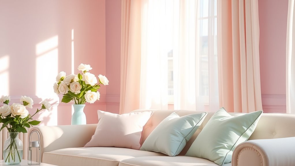
Pastel shades, with their soft and muted tones, can profoundly influence your emotional state. These gentle colors promote a sense of calm and tranquility, making your space feel welcoming and soothing. When you incorporate pastel shades into your environment, you often experience mood enhancement, as their subtle hues reduce feelings of stress and anxiety. Pastels are linked to feelings of relaxation and comfort, helping you unwind after a busy day. They don’t overpower your senses but instead create a peaceful backdrop that encourages mindfulness and clarity. Using pastel shades in your room can foster a positive mental state, making it easier to focus and feel at ease. Overall, these colors support emotional well-being and contribute to a harmonious living space.
Cultural Variations in Color Associations
Cultural backgrounds deeply influence how colors are perceived and the emotions they evoke. What symbolizes celebration in one culture may signify mourning in another. These differences stem from cultural symbolism and shape cross-cultural perceptions of color. For example:
| Color | Western Meaning | Eastern Meaning |
|---|---|---|
| White | Purity, peace | Mourning, death |
| Red | Love, excitement | Prosperity, good luck |
| Black | Elegance, authority | Bad luck, evil |
Understanding these variations helps you appreciate that color’s emotional impact isn’t universal. It’s shaped by cultural context, making it crucial when designing spaces for diverse audiences or exploring global influences. Recognizing these cultural nuances enriches your understanding of color symbolism worldwide.
Tips for Harmonizing Room Colors to Enhance Well-Being
Understanding the cultural meanings behind colors can help you create a space that promotes well-being and positive emotions. To achieve this, focus on harmonizing color schemes that suit your personal preferences and cultural context. Stick to a limited palette of complementary or analogous colors to prevent visual chaos. Incorporate mood-enhancing decor, such as soft lighting, textured textiles, and calming accents, to deepen the positive effect of your color choices. Use neutral tones as a foundation to balance bold or vibrant shades, making the room feel harmonious and inviting. Remember, consistency is key—avoid clashing colors that can disrupt your mood. By thoughtfully blending colors and decor, you can craft a space that not only looks good but also nurtures your mental and emotional well-being.
Frequently Asked Questions
How Does Lighting Affect the Perception of Room Colors and Their Mood Impact?
Lighting considerably influences how you perceive room colors and their mood impact. Bright, natural lighting enhances color saturation, making hues appear more vibrant and energetic. Soft, warm lighting creates a cozy ambiance, muting colors and fostering relaxation. Your choice of lighting ambiance alters the mood, emphasizing certain hues over others. When you understand this, you can select lighting that complements your desired atmosphere, shaping the emotional tone of your space effectively.
Can Color Schemes Influence Sleep Quality in Bedrooms?
You can improve your sleep quality by choosing color schemes that promote relaxation in your sleep environment. Opt for calming hues like soft blues, gentle greens, or muted neutrals that create color harmony and reduce stress. These soothing colors help your mind unwind, making it easier to fall asleep and stay asleep. By carefully selecting your bedroom colors, you support better rest and overall well-being.
Are There Specific Colors Recommended for Mental Health Recovery Spaces?
Imagine a therapy room painted in calming shades like soft blues or gentle greens, which are often recommended for mental health recovery spaces. These colors promote relaxation and reduce anxiety through color therapy. You might find that such calming shades create a peaceful environment, helping clients feel safe and supported. Incorporating these hues can enhance healing, making the space more effective in supporting mental health recovery.
How Do Personal Experiences Alter Individual Responses to Room Colors?
Your personal associations and cultural influences shape how you respond to room colors. For example, a color linked to positive memories may boost your mood, while one connected to negative experiences could evoke discomfort. These individual experiences influence your perception, making certain colors more calming or energizing for you personally. Recognizing this helps you choose room colors that support your mental well-being based on your unique background and associations.
What Role Do Seasonal Changes Play in Color Mood Effects Indoors?
Sure, seasonal color shifts aren’t just about fashion; they also influence your indoor mood. As outdoor colors change with seasons, they subtly affect your perception of space and vibe. You might crave cozy, warm tones in winter or invigorating, bright hues in summer. These outdoor color influences seep indoors, shaping your emotional response and making your surroundings feel more aligned with nature’s seasonal mood swings.
Conclusion
Just as Van Gogh’s vibrant strokes evoke emotion, your room colors shape your mood daily. By understanding the subtle language of hues, you can craft a space that whispers calm, energizes your spirit, or offers balance. Remember, like the Greek gods who wove meaning into every color, your choices influence your well-being. Embrace this power, and let your surroundings reflect the harmony you seek, turning your home into a sanctuary of mindful color.