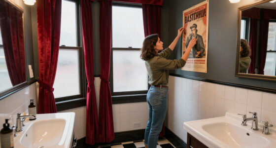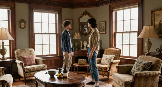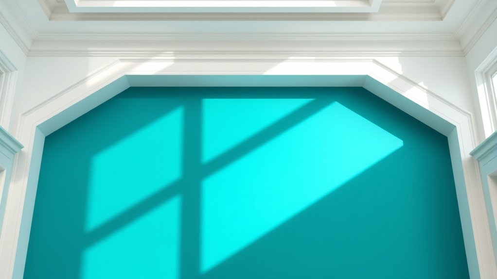

Using contrasting trim and wall colors can turn your space into a bold, visually engaging environment. Pair bright or saturated hues for a lively vibe, or go for muted tones for a sophisticated look. Sharp contrasts highlight architectural details and add depth, while softer differences create subtle separation. Experiment with bold color combinations to define areas or emphasize features. Keep your choices harmonious to avoid visual chaos—exploring these creative options can transform your room into an enthralling space.
Key Takeaways
- Use bold, saturated hues for trim against neutral or muted walls to create striking visual separation.
- Pair dark trim with light walls or vice versa to emphasize architectural details and add depth.
- Incorporate complementary color combinations for contrast, such as navy and blush or emerald and warm beige.
- Experiment with layered shades on trim and walls to achieve complex, sophisticated color blocking effects.
- Balance strong contrasts with softer hues to maintain harmony and prevent a chaotic or disjointed look.
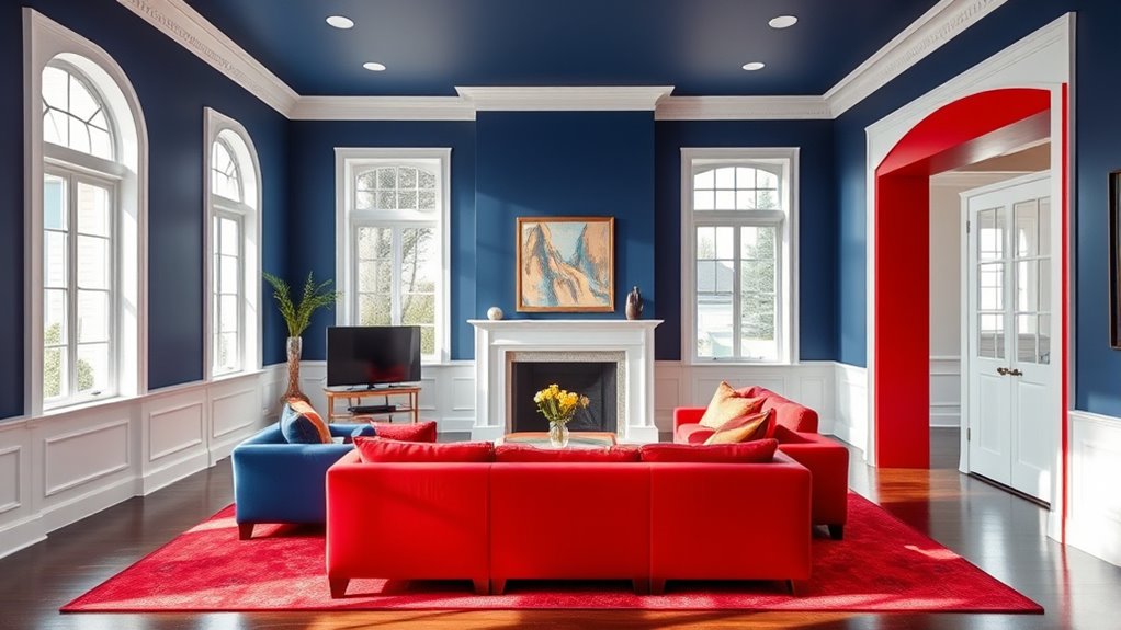
Choosing contrasting trim and wall colors can markedly enhance a room’s visual appeal by adding depth and interest. One of the most effective ways to achieve this is through color blocking, a technique that involves pairing bold or contrasting colors in defined sections of a space. When you use color blocking, you create clear visual separation between different areas or elements within a room, which can make the space feel more dynamic and structured. For example, painting the walls a soft neutral shade while using a darker or brighter trim color can make the trim stand out sharply, drawing your eye to architectural details and giving the room a modern, crisp look.
Color blocking isn’t limited to just two colors; you can experiment with multiple shades to create layered effects that add complexity and personality. When choosing your colors, think about the mood you want to evoke. Bright, saturated hues can energize a space, while muted or monochrome combinations lend sophistication and calmness. The key is to ensure that the contrast between the trim and wall colors is strong enough to create a striking visual separation but still harmonious enough to feel intentional. This balance prevents the room from feeling disjointed or chaotic.
Experiment with multiple shades to create layered, harmonious effects that add personality and sophistication to your space.
Using contrasting trim and wall colors also helps to define architectural features, such as crown molding, baseboards, or door frames. By selecting a trim color that sharply contrasts with the wall, you emphasize these details, making them pop. This technique can make a small room appear larger or a high-ceilinged space feel more intimate. It’s all about creating a visual hierarchy that guides the eye around the room, highlighting specific areas or structural elements. If you prefer a more subdued look, consider using a darker hue on the trim while keeping the walls light, or vice versa, for a softer, yet still noticeable, separation.
Incorporating contrasting colors for trim and walls is also a practical way to add personality without overwhelming the space. It allows you to experiment with bold colors in a controlled manner, anchoring the look with neutral or subdued wall tones. Additionally, this approach can be easily updated or changed over time, giving you flexibility as your style evolves. Remember, the goal is to create visual separation that enhances the room’s design rather than distract from it. When carefully planned, contrasting trim and wall colors can transform a plain room into a captivating, visually layered space that reflects your personality and taste.
A well-chosen color scheme can also complement other farmhouse design elements, creating harmony and cohesiveness within the space such as vintage furniture or rustic accents.
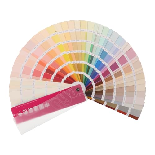
FAVOMOTO 1 Set Standard Paint Sample Cards, 365 Colors Walls Paint Chips Samples Architecture Contrast Sheets Color Chart for Painting Projects
- Practical for Various Paint Needs: Color test and sample cards for painting projects
- Durable Material: Made of plastic and paper for accurate colors
- Suitable for Professionals and DIY: Ideal for both experts and hobbyists
As an affiliate, we earn on qualifying purchases.
As an affiliate, we earn on qualifying purchases.
Frequently Asked Questions
How Do I Choose the Right Contrast for Small Rooms?
To choose the right contrast for small rooms, start with color harmony by selecting a light, neutral wall color. Then, pick trim in a darker shade to create depth. Use durable, high-quality paint to guarantee longevity. Opt for contrasting colors that highlight architectural features without overwhelming the space. This approach makes the room feel larger and more inviting, while also maintaining a stylish, cohesive look.
What Color Combinations Make a Space Feel Larger?
Want your room to seem endless? Use light, airy shades like soft blues or gentle neutrals that reflect color psychology’s magic. Keep walls and trim in harmonious tones to create visual harmony, making the space feel larger. Dark accents? They’ll only trap your sense of space. Embrace the illusion of openness with clever color combinations, because who needs walls to be the only thing expanding?
Can Contrasting Colors Hide Wall Imperfections Effectively?
Yes, contrasting colors can hide wall imperfections effectively. By using color blocking or accent wall ideas, you draw attention away from flaws and create visual interest. Opt for darker shades on imperfections or combine bold trim with contrasting walls to add depth. This technique not only conceals uneven textures but also adds a stylish touch to your space, making imperfections less noticeable while enhancing your room’s overall design.
What Are the Best Contrasting Trim Colors for Modern Decor?
Imagine your room as a canvas waiting for bold strokes—bright white or sleek black trim often steals the show in modern decor. Using the color wheel, you see these timeless choices create striking contrast, energizing the space. Color psychology suggests white can evoke freshness, while black adds sophistication. Choose a trim color that aligns with your vibe, and watch your room transform into a stylish masterpiece.
How Do Lighting Conditions Affect Perceived Color Contrast?
Lighting impact greatly influences how you perceive color contrast. In bright, natural light, colors appear more vibrant and sharp, making contrasting trim stand out vividly. Conversely, in dim or warm lighting, the contrast softens, and colors may seem muted or blended. You should consider these lighting conditions when choosing trim and wall colors, ensuring your selected contrast maintains its intended effect throughout different times of day.

YOA Sheepskin Texture Wall Paint, Art Paint, Manor White 32 oz, For Walls and Ceilings – DIY Wall Repair and Decorative, Finish for Living Room Bedroom Hallway
- Easy to Use: Open, stir, and apply easily
- Decorative Color Options: Wide range of hues for style
- Application Instructions: Apply in two coats with drying time
As an affiliate, we earn on qualifying purchases.
As an affiliate, we earn on qualifying purchases.
Conclusion
By experimenting with contrasting trim and wall colors, you open a world of stunning possibilities that can transform any space into a masterpiece. Don’t be afraid to get bold—your choices can make your home feel as vibrant as a sunrise or as dramatic as a thunderstorm. With a little creativity, you’ll turn your walls into a breathtaking canvas that leaves everyone in awe. So go ahead, make your space unforgettable—your perfect color combo is just waiting to be discovered!

JONYEE Colored Masking Tape, Colored Painters Tape for Arts & Crafts, Labeling or Coding – Art Supplies for Kids – 6 Different Color Rolls – Masking Tape 1 Inch x 13 Yards (2.4cm X 12m)
- Durable and versatile: Tears by hand, adheres to various surfaces
- Easy to use: Secure adhesive, simple to tear and reposition
- Vibrant color variety: Includes blue, purple, orange, green, yellow, red
As an affiliate, we earn on qualifying purchases.
As an affiliate, we earn on qualifying purchases.
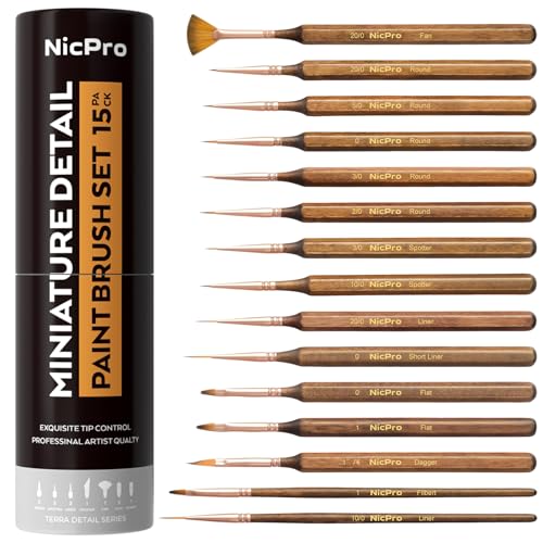
Nicpro 15 PCS Extreme Miniature Paint Brushes,Fine Micro Model Detail Brush
- Variety of Shapes and Sizes: 15 fine point brushes for detailed work
- High-Quality Synthetic Bristle: Suitable for acrylic, gouache, oil, watercolor
- Shape Retention and Durability: Bristles hold shape after long use
As an affiliate, we earn on qualifying purchases.
As an affiliate, we earn on qualifying purchases.