
In 2025, your color palette will focus on warm caramel, earthy green, and smoky beige. These hues create a cozy, inviting atmosphere while reflecting themes of sustainability and innovation. Use caramel for warmth, green to connect with nature, and beige as a versatile neutral. Combining these shades can inspire modern yet timeless designs in interior spaces and fashion. Keep exploring to discover how these colors can transform your style and environment.
Key Takeaways
- The 2025 color palette centers around warm, inviting tones like caramel, complemented by earthy green and smoky beige for a balanced, natural aesthetic.
- Warm caramel serves as the key hue, evoking coziness and sophistication in both interior design and fashion.
- Earthy green symbolizes growth and sustainability, pairing well with caramel for organic contrast and renewal themes.
- Smokey beige provides a versatile, neutral backdrop that adds depth and warmth, anchoring the palette with a refined touch.
- These colors reflect a blend of optimism, sustainability, and technological innovation, inspired by nature and seasonal influences.
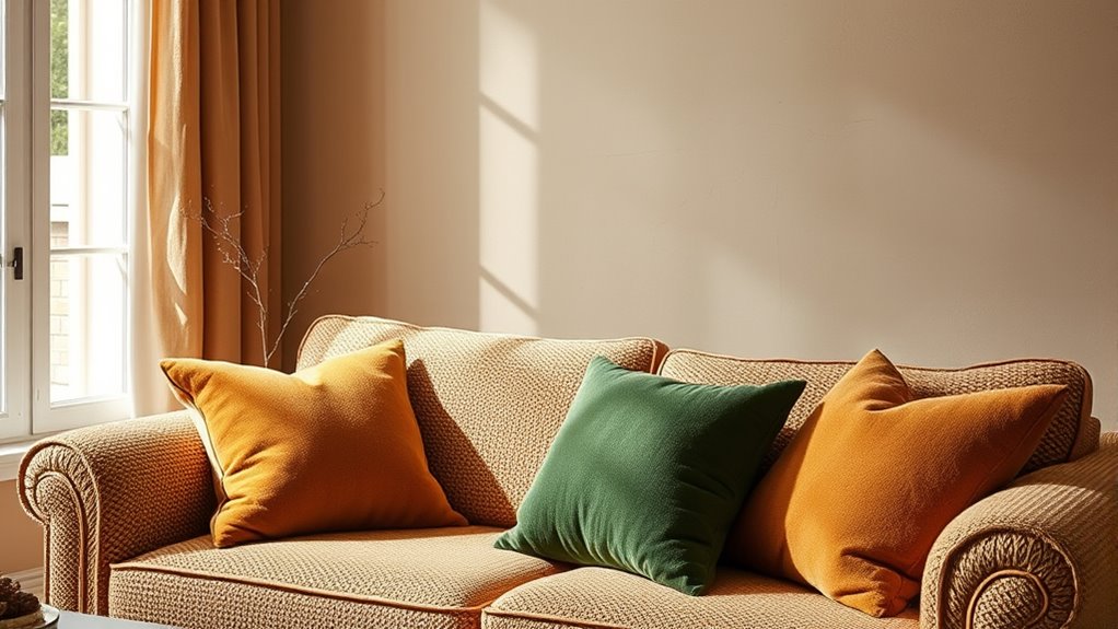
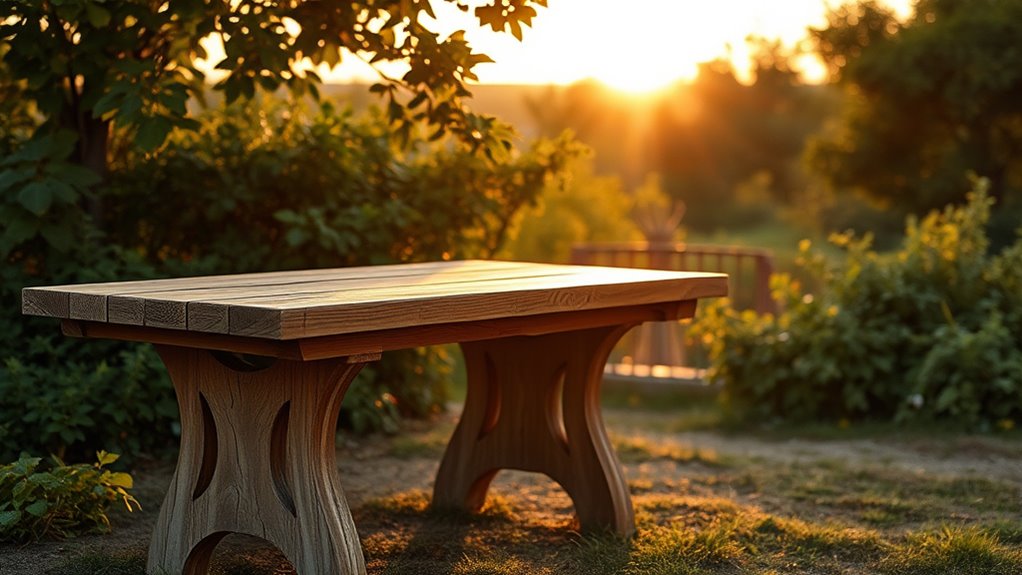
As we look ahead to 2025, color palettes are expected to reflect a blend of optimism, sustainability, and technological innovation. This means you’ll see a shift toward warm, inviting tones that evoke a sense of comfort while also embracing a forward-thinking mindset. When exploring trendy color pairings for the upcoming year, think about how these hues can be combined to create fresh, harmonious looks inspired by seasonal palette inspirations. These combinations will help you craft environments and designs that feel both modern and timeless, rooted in nature but enhanced by innovation. Incorporating natural materials like wood, stone, and linen can further emphasize the connection to nature and sustainability in your design choices. Warm caramel is set to take center stage in 2025. This rich, inviting hue exudes coziness and sophistication, making it perfect for both interior spaces and fashion. It pairs beautifully with earthy greens and softer neutrals, creating a natural palette that resonates with sustainability themes. When you combine caramel with a deep, earthy green, you introduce an organic contrast that feels grounded yet lively. This pairing captures the essence of seasonal palette inspirations—earthy tones that reflect the changing seasons, from lush summer greens to muted autumn browns. These color combinations evoke feelings of stability and renewal, aligning with a growing desire for eco-conscious choices. Earthy green, inspired by lush foliage and thriving ecosystems, will also play a significant role in 2025’s color landscape. It’s versatile enough to complement warm caramel but also stands strong on its own. This color symbolizes growth, balance, and a connection to nature—values that resonate deeply in today’s design and lifestyle trends. You can incorporate earthy green into your decor or wardrobe by pairing it with smoky beige for a subtle, sophisticated look. These shades work well in creating layered, textured spaces that feel both calming and invigorating. Think of seasonal palette inspirations that draw from the natural world—think moss, olive, or sage—these shades can be mixed and matched to reflect the changing seasons while maintaining a cohesive aesthetic. Smokey beige offers a neutral yet complex backdrop that anchors these trend-forward colors. Its muted tone adds depth and warmth without overpowering the palette. When combined with caramel and green, smoky beige provides a versatile base that allows other colors to shine while maintaining an understated elegance. This shade is perfect for creating cozy interiors or sophisticated fashion looks that emphasize subtlety and refinement. As you explore seasonal palette inspirations, consider how smoky beige can serve as a transitional color that adapts to various environments, echoing the idea of sustainability and technological progress. Overall, these shades will enable you to craft spaces and styles that feel both current and timeless, rooted in nature but enhanced by innovation.
Frequently Asked Questions
How Can I Incorporate These Colors Into a Small Space?
You can incorporate these colors into a small space by adding decorative accents like cushions, vases, or artwork in warm caramel, earthy green, and smokey beige. Consider painting a color accent wall to create depth without overwhelming the room. Mixing these shades with neutral tones keeps the space open and inviting, while strategic accents bring warmth and personality. Keep it simple to avoid clutter and maximize the cozy feel.
Are These Palettes Suitable for Outdoor Design Projects?
These palettes are perfect for outdoor design projects, and here’s why—your space will radiate warmth and natural beauty! With the right outdoor furniture and finishes, you can guarantee weather resistance and durability against the elements, making your outdoor area last for years. Incorporate warm caramel, earthy green, and smokey beige into your landscape or patio, and watch your outdoor space transform into a stunning, resilient sanctuary.
Which Color Combinations Work Best With These Palettes?
You should consider pairing warm caramel with deep blues or rich teals for striking complementary contrasts, adding vibrancy to your outdoor design. Earthy green works beautifully with soft browns or muted oranges in monochromatic schemes, creating harmony. Smokey beige pairs well with darker greys or charcoals, providing subtle contrast. These combinations enhance the natural feel of your space, making it inviting and visually balanced with both contrasting and monochromatic options.
How Do These Colors Influence Mood and Atmosphere?
These colors create a warm, calming atmosphere that promotes comfort and relaxation, enhancing the emotional impact of color in your space. Warm caramel evokes coziness and friendliness, while earthy green inspires balance and connection to nature. Smokey beige adds sophistication and tranquility. Culturally, these shades often symbolize stability, growth, and harmony, making your environment feel welcoming and grounded. Use them intentionally to influence mood and foster a peaceful, inviting atmosphere.
What Are Some Popular Materials to Pair With These Shades?
You’ll want to pair these shades with natural materials like wood, rattan, and linen to enhance their earthy vibe. Incorporate textured finishes like matte, brushed, or satin to add depth, while glossy finishes can create contrast and elegance. For a cozy feel, choose materials with tactile textures, and for a sleek look, opt for smooth, polished surfaces. These combinations will make your space feel warm, inviting, and stylish.
Conclusion
As you step into 2025, let these warm caramel, earthy green, and smokey beige hues be your palette of possibility. Imagine a cozy, sunlit forest where each color whispers comfort and nature’s serenity. Embrace these tones to create spaces that feel like a gentle hug or a quiet walk through the woods. With these colors, you’re not just decorating—you’re painting your world with the calm and warmth of a perfect sunset.